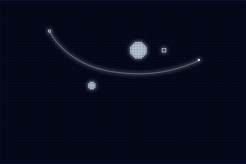
It’s been roughly a month since we started working on our gravity game, tentatively titled ‘Gravitate’. Dave wrote the flash proof of concept in around two and a half hours and it took around 12 hours, spread out over a few days, to get the game up and running with the visual style that we showed in the last post. Here’s a video of the game as of two weeks ago. The video shows an exaggerated guide for firing projectiles because we think it looks awesome. At the moment the levels are generated randomly, to be honest we’re surprised how much fun some of the levels have turned out to be.
Since that video was taken we’ve started work on a more fully featured level editor, we’re not sure if this will show up in the initial release of the game or not as we’ve tied it to a local server for convenience of loading, saving and sharing levels without the need to rebuild.
At the moment we’re ready to start beta testing core gameplay, but we’re going to hold off until we’ve some new gameplay features added along with our music. We’ve commissioned some retro chip tune music to be written for the game, when we get the final masters we’ll put some previews up.
That’s all for now, stay tuned for more updates later in the week.
Work is underway on our new project. The motivation is fantastic.
The two of us have really got back into the joy of game creation once again. The new year is being good to us for sure.
The idea for this project is to keep things simple simple simple! No overloading the game with too many additions to the base game and keeping the graphics very minimalist but still have a little bit of pretty.

Screen Shot 1: Updated version of the concept art. Pixels are much smaller and allows us to create larger levels. We are looking at having 6 planets in later levels. The smaller pixels also lead to other ideas we might explore.

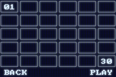
Screen Shot 2: Sample level select screen. Need to find a nice free pixel font. Add some indication of which levels are cleared and actually write all those numbers between 1 and 30!


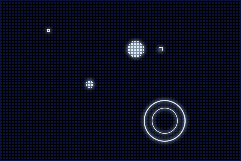
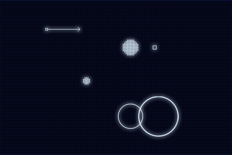
Screen Shot 3 & 4: Concept idea for our control input. Two circles appear when the thumb touches the screen and the player can drag the smaller one to change the direction and speed of the shot. This will cause the direction arrow on the start area to change direction and length also. This fixes the problem we had with controls on the flash version not being useful in all situations on the iPhone. Mainly if the start area is close to the edges of the screen and you can’t get enough pull back on the shot.
We’re writing a short design doc now to lock down everything and avoid feature creep later on. Expect another blog post after it’s done discussing our scoring system and maybe a look at a second simple game mode.
There’s no arguing with that, and we here at Digital Sideburns would not like to run afoul of Newton, Kepler and Einstein, even though they’re all dead… in that case we would not like to run afoul of Zombie Newton, Zombie Kepler and Zombie Einstein!
In an effort to appease the gods of science, we are taking a break from working on “Fray” and we are going to produce a game in a similar vein to “Gravity Wars”. Ladies and Gentlemen, may I introduce you to our latest iPhone project: Codename Shoot the Blue Guy!

Gravity Game
We were messing around with Adobe Flex the other day and we created this little demo: Gravity Game. We ended up playing that a lot more than we should have, approximately a million times longer than it took to program. Ok, that’s a lie… that would amount to 285.19 years of play-time, but it’s close.
We’ve been keeping our cards close to our chest lately with regards to the development of “Fray”, but we’re going to develop this game in the open. Over the next few weeks expect a barrage of updates and a call for beta-testers very soon.
The game will be released for the iPhone, pending Apple’s approval in both full and lite versions. We’ll post more propaganda right here, stay tuned!
Baz and Dave

